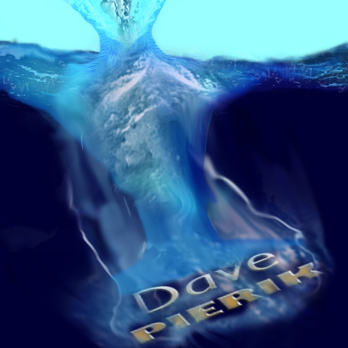
Text Drops in Water Effect
For this, I started from the following tutorial:
http://www.psdvault.com/text-effects/design-a-texts-drop-in-water-typography-effect-in-photoshop/
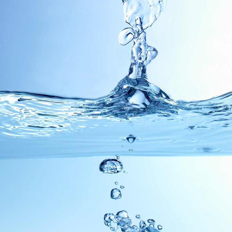
I kept having different choices and adding to it, so my version is very different. I wanted something thicker, with more going on. I used several images of water from Microsoft's public stock images. Honestly, it was only after I had colorized everything at the end that I realized that my top splash and shape of water ends up looking a bit like a person. That was never my intent but it is actually kind of cool.
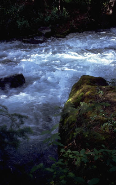
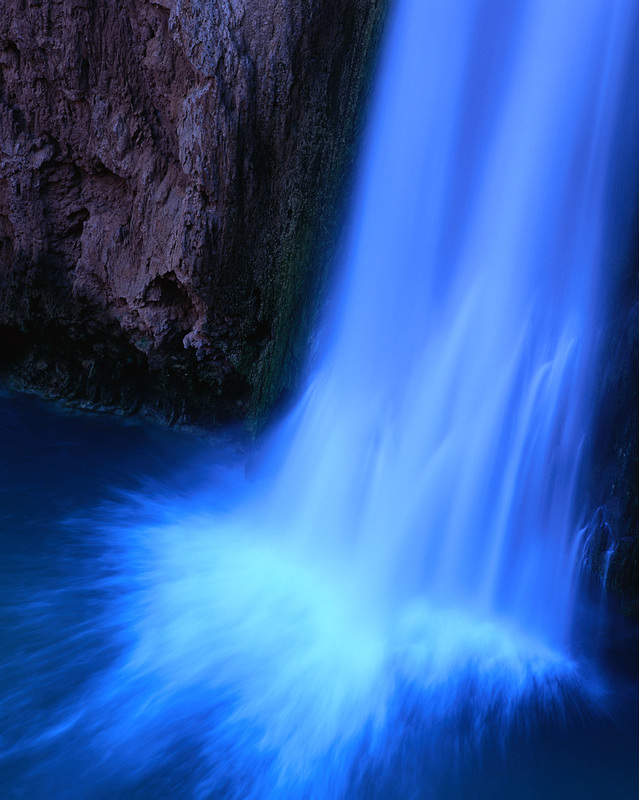
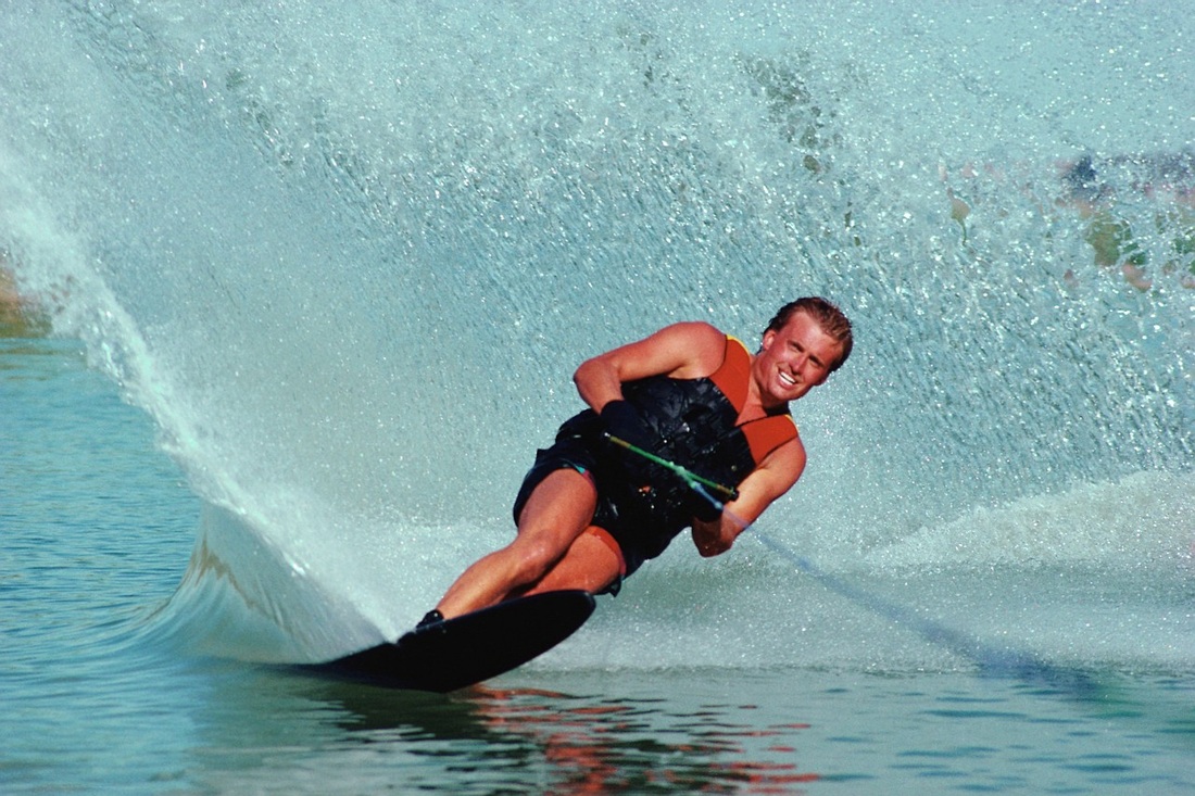
Some of the images I used are below, it is possible there were a couple of others from which I used bits and pieces. I did a lot of heavy morphing, copying, turning things black and white and then adding color back. The multiple layers make sense because really water has lots of layers anyway.
http://www.psdvault.com/text-effects/design-a-texts-drop-in-water-typography-effect-in-photoshop/
I kept having different choices and adding to it, so my version is very different. I wanted something thicker, with more going on. I used several images of water from Microsoft's public stock images. Honestly, it was only after I had colorized everything at the end that I realized that my top splash and shape of water ends up looking a bit like a person. That was never my intent but it is actually kind of cool.
Some of the images I used are below, it is possible there were a couple of others from which I used bits and pieces. I did a lot of heavy morphing, copying, turning things black and white and then adding color back. The multiple layers make sense because really water has lots of layers anyway.
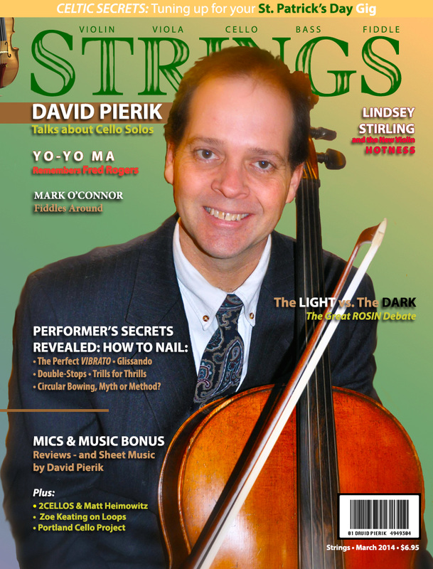
Magazine Cover
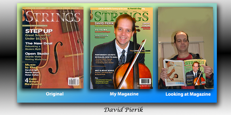
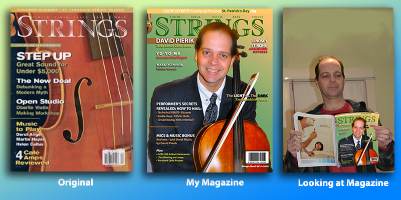
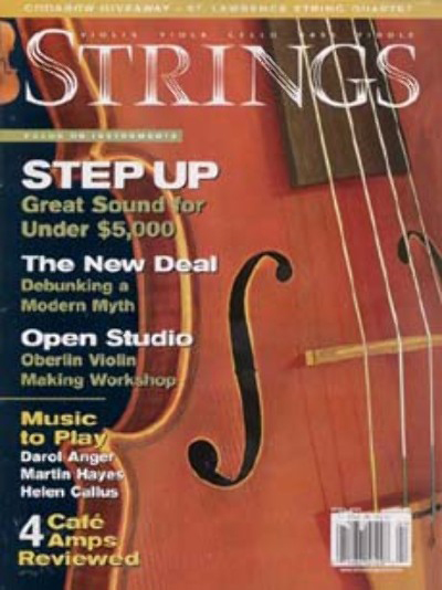
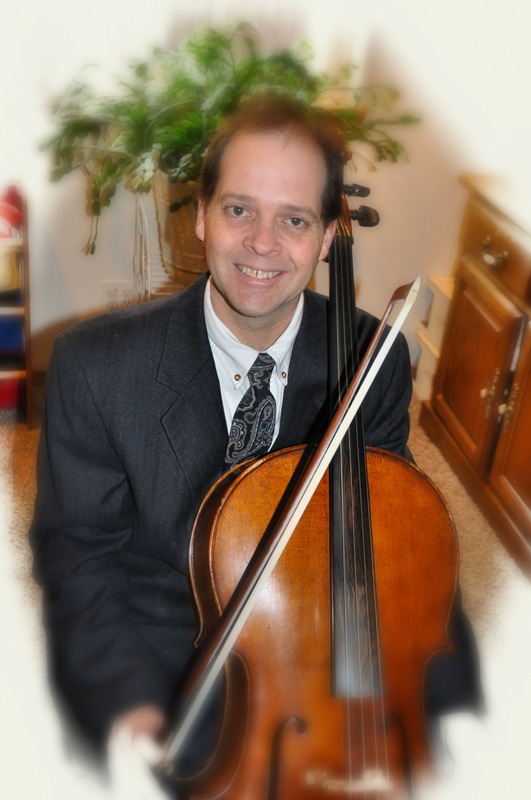
This assignment required me to use most if not all of the Photoshop image editing skills I have learned so far. I built my "STRINGS" magazine cover (center) from scratch. The top row below (scroll down and click for a closer look) shows things I created. Elements and the Strings style sample are shown on the row below that. Although I don't play cello for a living, I have been moonlighting as a cello soloist for weddings and events for nearly 20 years now. Included on my cover are some of my cello heroes and a couple of violinists also. It is true that I also compose and if pressed (and time allowed it) I could interview the people featured on this cover. I would have no problem writing, editing and photographing every one of the cover teaser stories, including composing the promised sheet music.
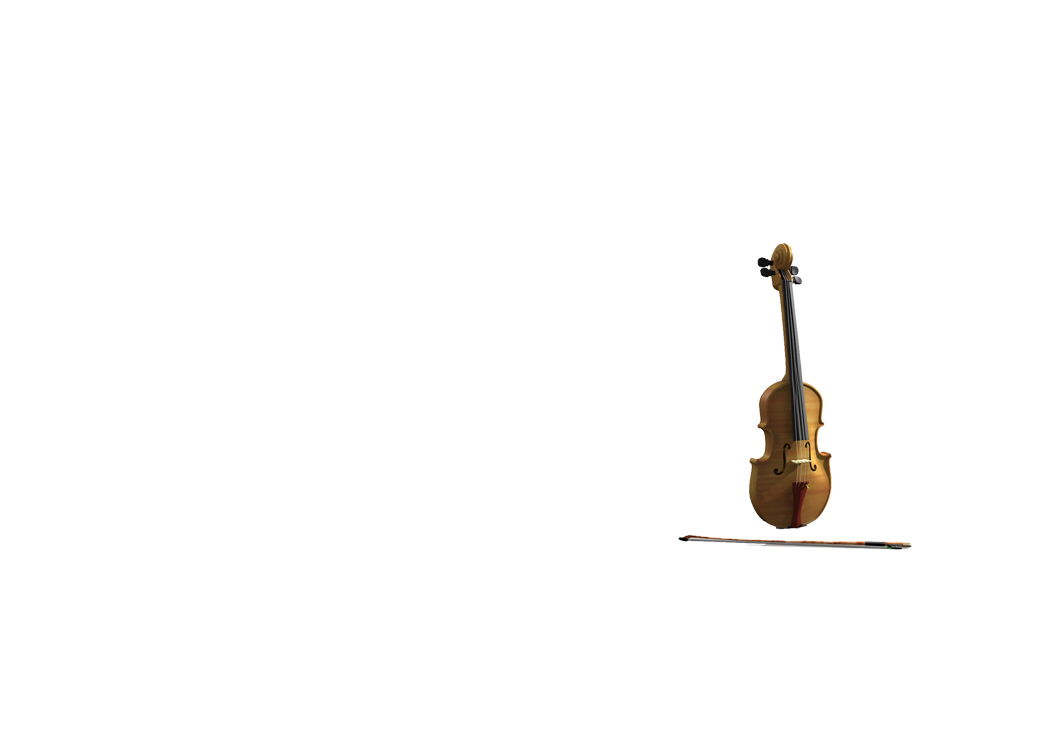
I could not find any font that matched "STRINGS" so what I created was a painstaking modification process involving the brush tool on a layer mask over the top of what I figured out was at its core a font very much like Times. That discovery saved me a lot of time. The photo of me with the cello was sent to me by a fan, exactly the way it appears on the bottom row - including the blur effects which made including my hands in the shot a challenge I attempted, and then abandoned. I trimmed it out and it fit fine the way I did it anyway, over the top of a gradient background. My notes for the bar code are below. I updated that file by putting my name on it as the assignment required (originally I had just put numbers into it). The violin is a stock photo from Microsoft Images.
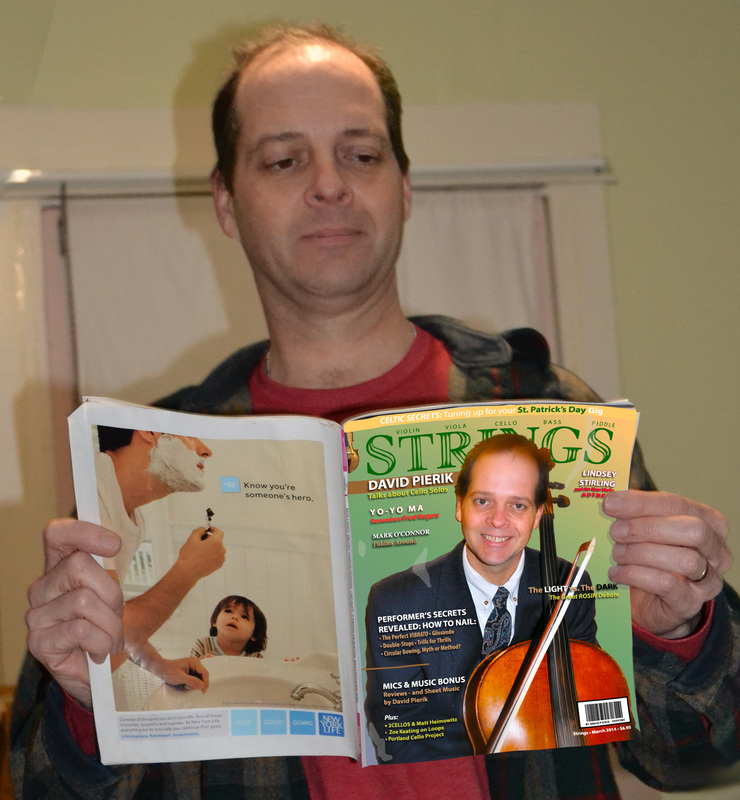
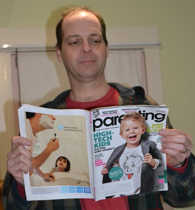
My wife shot the photo of me looking at "parenting" magazine, which I modified as above. If you look closer below you can see that it bends and has shadow as well as glare on it. For the natural bends I used the Puppet Warp tool. For the shadow sheen glare I made an extra layer then used the brush in dark and light gray and adjusted the opacity. I used a mask layer around my fingers. As a result of these touches my edition of Strings looks much more realistic but no, I never actually printed a copy of my fake magazine.
To fix the shape for the tryptic I decided to add more ceiling, by making a copy of the image and moving it up, then using the eyedropper tool, the brush tool and the smudge tool. I then selected and merged those layers before adding the drop shadow to the completed rectangle. In the process I discovered that using the eraser tool and the shift key you can erase straight lines.
I could not find any font that matched "STRINGS" so what I created was a painstaking modification process involving the brush tool on a layer mask over the top of what I figured out was at its core a font very much like Times. That discovery saved me a lot of time. The photo of me with the cello was sent to me by a fan, exactly the way it appears on the bottom row - including the blur effects which made including my hands in the shot a challenge I attempted, and then abandoned. I trimmed it out and it fit fine the way I did it anyway, over the top of a gradient background. My notes for the bar code are below. I updated that file by putting my name on it as the assignment required (originally I had just put numbers into it). The violin is a stock photo from Microsoft Images.
My wife shot the photo of me looking at "parenting" magazine, which I modified as above. If you look closer below you can see that it bends and has shadow as well as glare on it. For the natural bends I used the Puppet Warp tool. For the shadow sheen glare I made an extra layer then used the brush in dark and light gray and adjusted the opacity. I used a mask layer around my fingers. As a result of these touches my edition of Strings looks much more realistic but no, I never actually printed a copy of my fake magazine.
To fix the shape for the tryptic I decided to add more ceiling, by making a copy of the image and moving it up, then using the eyedropper tool, the brush tool and the smudge tool. I then selected and merged those layers before adding the drop shadow to the completed rectangle. In the process I discovered that using the eraser tool and the shift key you can erase straight lines.

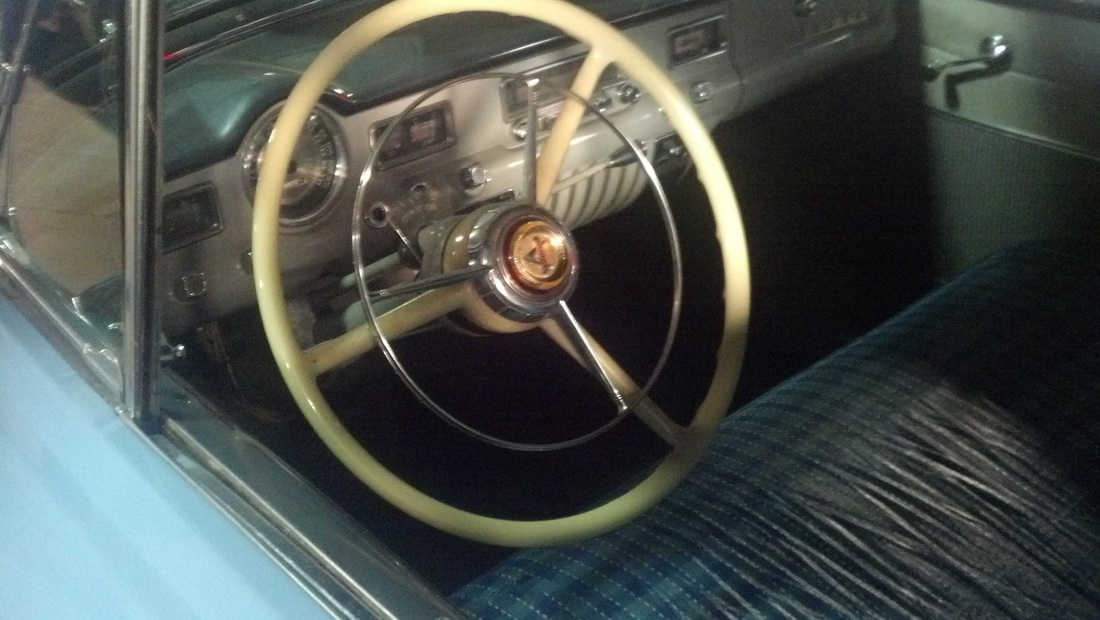
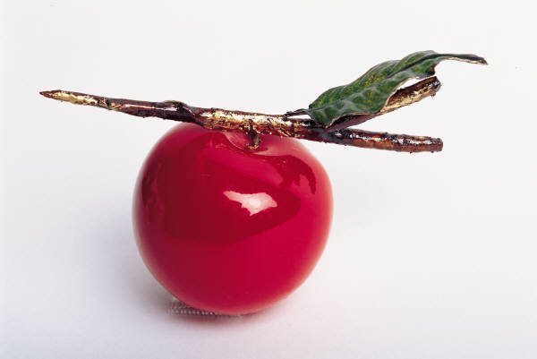
Banner
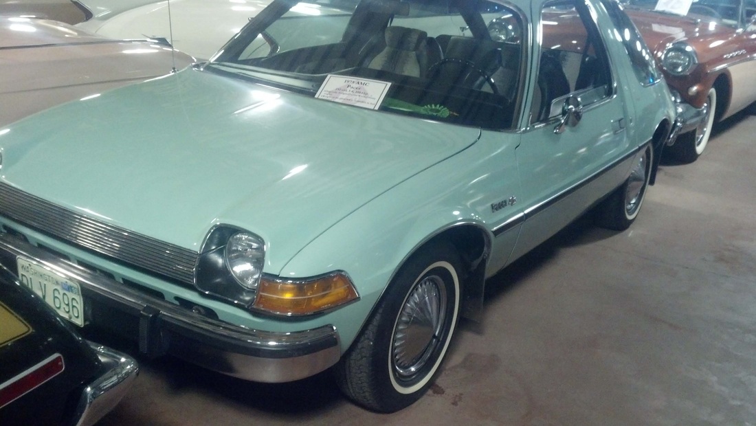
So from previous assignments I have been getting the hang of a lot of things. The above banner looks simple but I used a lot of techniques to put it together. I have been milking my big reserve of photos I took at the LaMay Car Museum for several assignments but to my knowledge I have not used the Pacer or this interior photo yet. The lemon and cherry are from the public Microsoft Image library.
Barcode
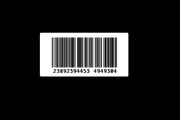
I made this by following a tutorial from class. It looks very real but it is not. There are times when you want the appearance of a bar code without it actually being a working bar code. It really is amazingly real looking.
Type on a Path
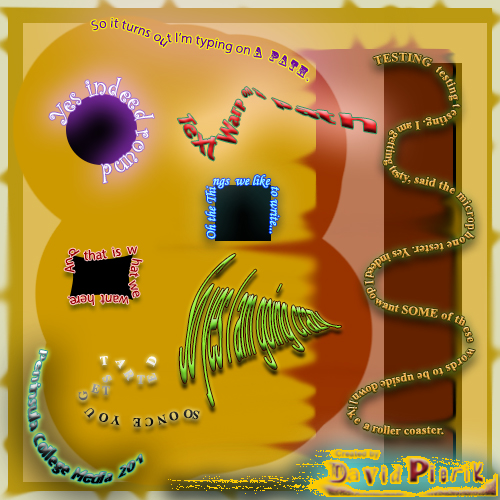
I really enjoyed goofing around on this, playing with Photoshop tools. I started by making an interesting background using the gold and red, the rectangle tool, the brush tool and the smudge tool and a couple of layers of different opacity. Then, using various shape tools, the Pen tool, Path layers, the type on a curve tool and layer styles, I put this together. It was great practice and there were some tools that I had either not used or barely used that I became more familiar with just by doodling.
