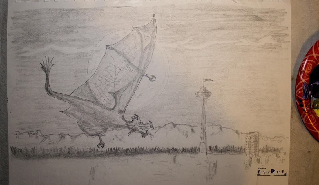
Manticore Dragon over Seattle
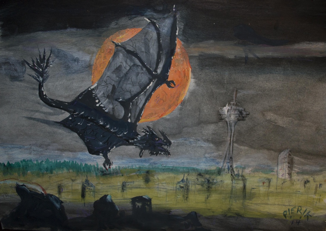
Manticore Dragon over Seattle, graphite, colored pencil, crayon, watercolor and watercolor wash on paper, ©2014 by David V. Pierik, all rights reserved.
In memory of Evanston Thomsen, who I played D&D with when 2nd edition was new, and of Robert V. Pierik, my father – who bought me my first D&D book when "Advanced Dungeons & Dragons" was new. I know all of our imaginations live on. Thank you dad and Evan for sharing your lives, your humor and stories with me. Although it hurts to lose both of you in the same week, somehow I am at peace, knowing that wherever you are, your ideas live on.

Alphabet of Art:
The Attributes
(Click gallery images for larger view)
Emotional Attribute
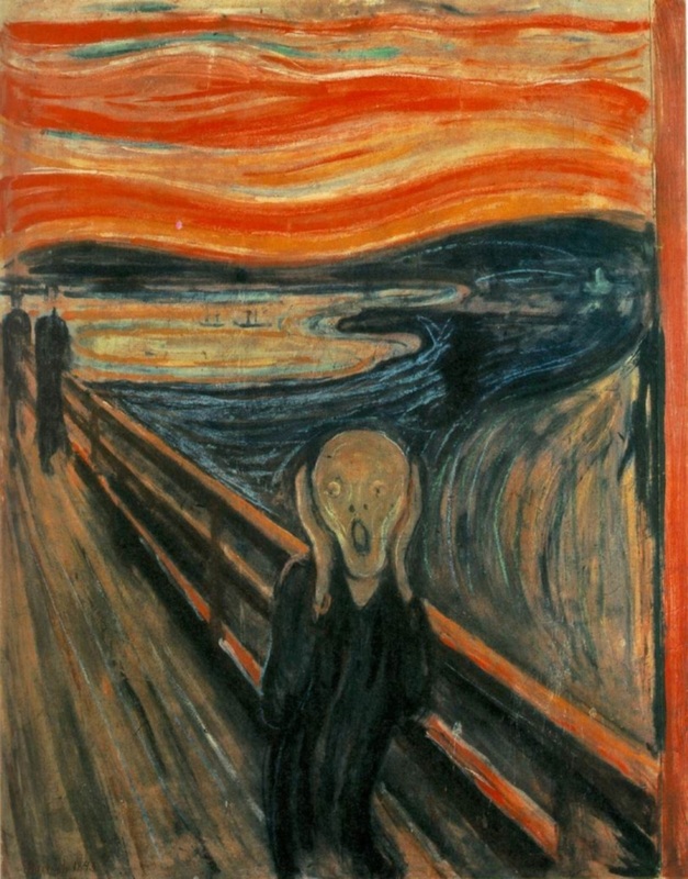
Perhaps the most famous emotional painting of all time, The Scream by Edvard Munch, speaks for itself. Here we have a figure of complete fright. The maximum contrast is on the emotional attribute here, which is highly active, while the minimum contrast is passive. While spatial and esthetic elements are also present in this work with the depth of the rail and the play of color and style, the emotional dominates. I think Munch was trying to portray the very essence of the mood of fear and part of how he achieves that is with the contrast of the beautiful and placid water and sunset colors in the background, with the horrified figure at front and center.
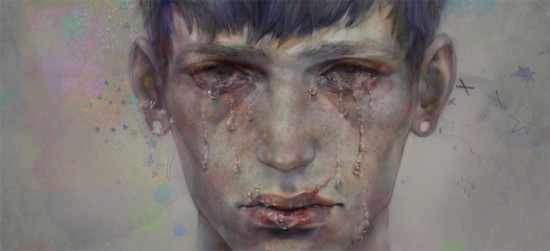
Above at center we have untitled, created by 非 (English translation unknown), which depicts hurt and sadness on a deep level with disturbing detail and emotion. This is a more recent work, in which the artist might be trying to provoke a reaction from the viewer. The emotional component here stands alone, with effectively little to no esthetic or spatial elements at all, simply the raw mood. The artist could well be trying to portray the height of human suffering, such as that of the victims of the plight of human trafficking.
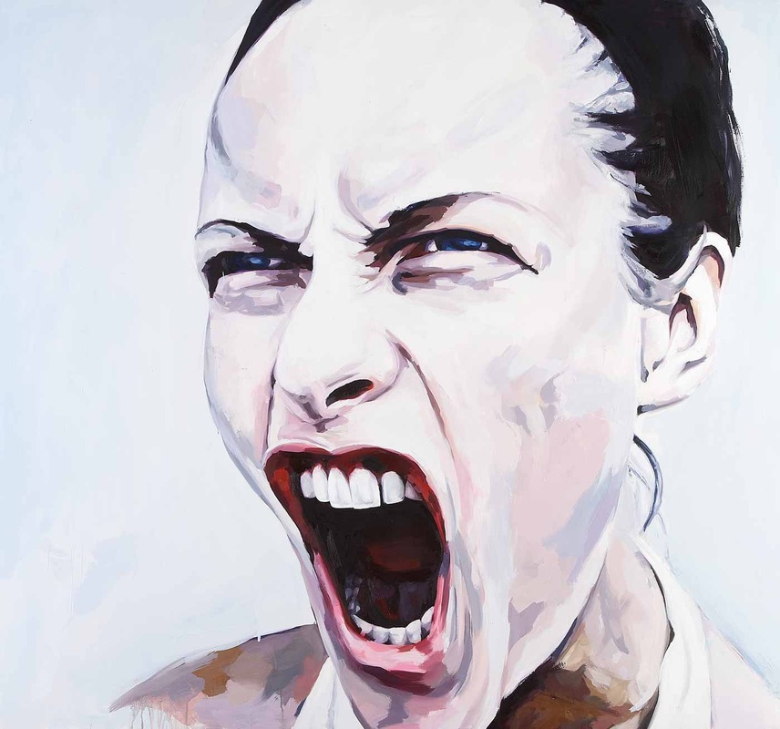
At right is Polarity by Duarte Vitoria, which once again utilizes the power of human facial expression to convey emotion. The mood here is intense, perhaps from anger, but also possibly a reaction at a major sports event or rock concert. There is also a style here, an aesthetic of color that accentuates the intensity of the mood. In my opinion, this is the artist portraying someone yelling to get the viewer's attention – perhaps just to look at the work itself.
Above at center we have untitled, created by 非 (English translation unknown), which depicts hurt and sadness on a deep level with disturbing detail and emotion. This is a more recent work, in which the artist might be trying to provoke a reaction from the viewer. The emotional component here stands alone, with effectively little to no esthetic or spatial elements at all, simply the raw mood. The artist could well be trying to portray the height of human suffering, such as that of the victims of the plight of human trafficking.
At right is Polarity by Duarte Vitoria, which once again utilizes the power of human facial expression to convey emotion. The mood here is intense, perhaps from anger, but also possibly a reaction at a major sports event or rock concert. There is also a style here, an aesthetic of color that accentuates the intensity of the mood. In my opinion, this is the artist portraying someone yelling to get the viewer's attention – perhaps just to look at the work itself.
Image selection and commentary by David V. Pierik
Click links to visit sites for each work.
Click links to visit sites for each work.
Aesthetic Attribute
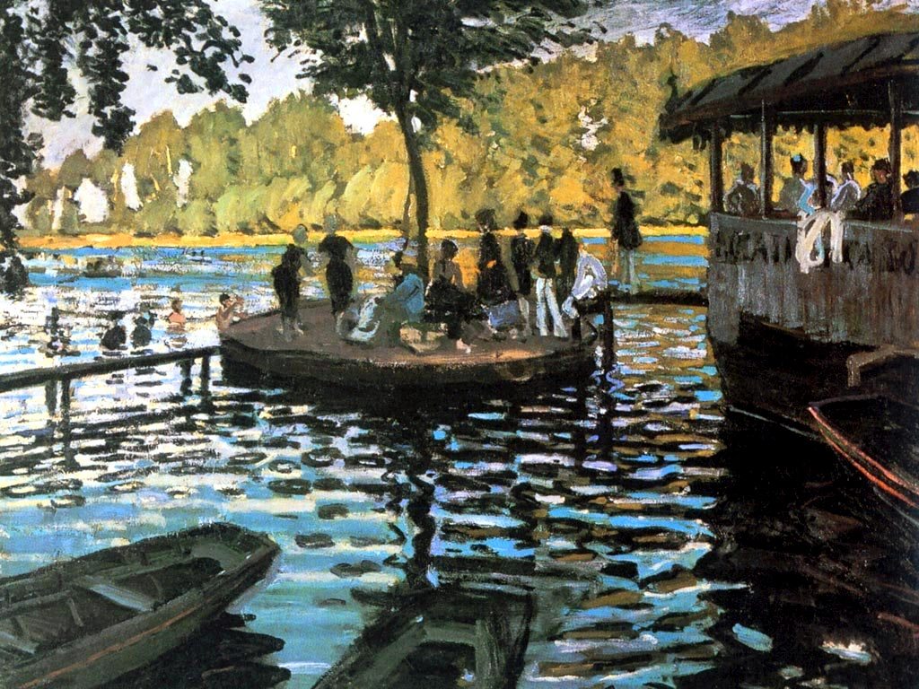
At left is Claude Monet, Bain à la Grenouillère (1869) which captures the look and feel of the water, the play of light and shadow and placement of elements as to reach an aesthetic, almost decorative style. There is the impressionistic style of the painting itself, which has its own aesthetic. In addition there is a wonderful symmetry between the angle of the objects on the right and left, with the central area. There is also a wonderful a dynamic, gently tugging between light and dark; one can almost hear the lapping of the water. The spatial attribute element is also present, and together the work does convey a calm emotional attribute, whether intentionally or unintentionally. I think Monet very likely worked from life in this masterful painting, and probably spent considerable effort locating this special place, though it is likely he chose his own postures and clothing colors for the people to strengthen the composition of the painting with contrasts of light shirts in shadowy areas and dark clothing in the lighter area at the left. Such details contribute the genius of this work.
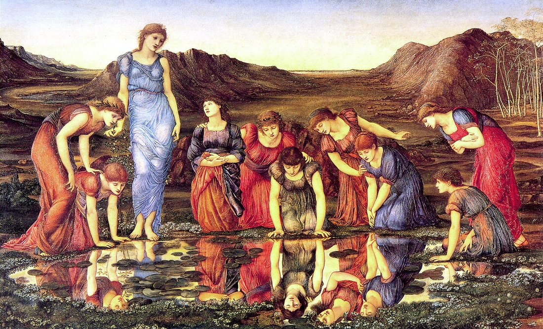
At center is The Mirror of Venus by Edward Burne-Jones (1875), a work which creates a pattern of beauty through color choices and reflections. This pattern has a naturalness about it, in the way of the symmetry of a flower in terms of color palette. Burne-Jones was most likely simply trying to portray beauty here. If you look at the reds and purples, there is a deliberateness to their arrangement, creating a pleasing aesthetic. Although there is a spatial element to the depth of the landscape, it is secondary. There is also a warmness, a vague emotional attribute of sisterhood and love. Note the starkness and redness of the landscape behind the figure of Venus at left, and how it is similar to the colors of Mars. I think that in this work, the artist was earnestly trying to portray the classic beauty of the Venus of Roman mythology. It is possible that there are other levels of meaning to this painting in that there are 10 figures total and as such Burne-Jones might have been referencing the Roman mythos itself, or possibly astronomy as an intended meaning.
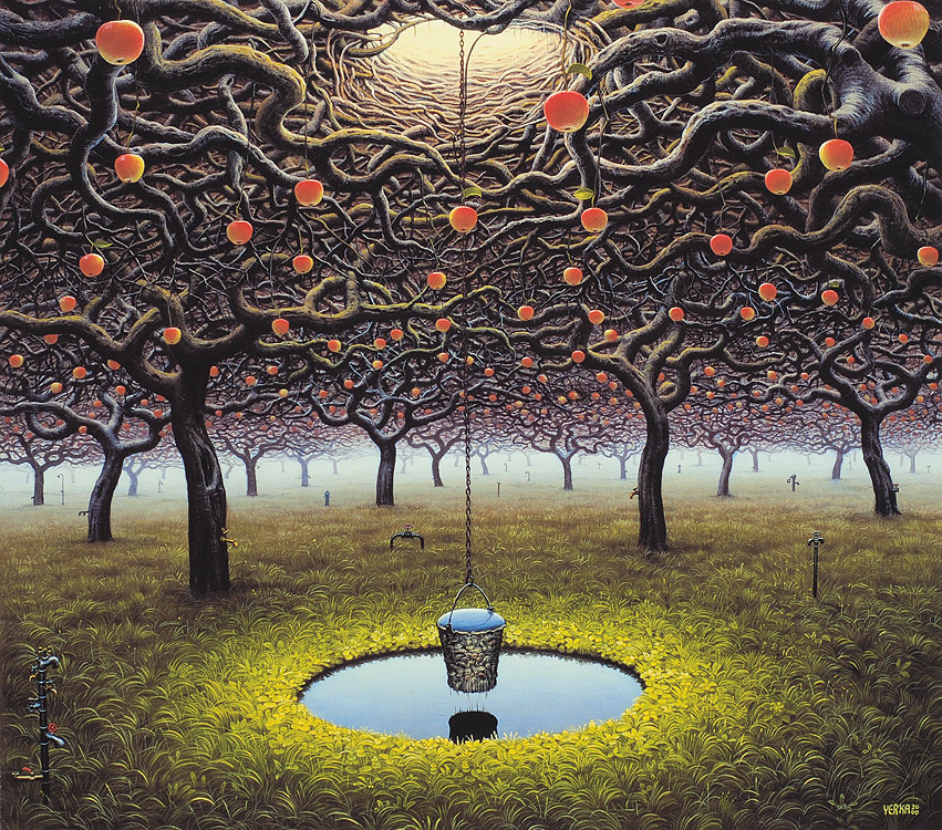
To the right is an untitled work from 2000 by the artist Jacek Yerka. Here, we see a highly stylized, semi-symmetrical fantasy landscape, with highly decorative elements. Primarily this is also an aesthetic work, though it does include curious emotional qualities as well as spatial interest. The artist might have been attempting to portray high conceptual ideas such as the garden of Eden or other religious references, or simply fantasy and magical imagery. That said, it would not be impossible to recreate this scene in real life, given the right resources; in truth nothing shown is impossible or unnatural.
At center is The Mirror of Venus by Edward Burne-Jones (1875), a work which creates a pattern of beauty through color choices and reflections. This pattern has a naturalness about it, in the way of the symmetry of a flower in terms of color palette. Burne-Jones was most likely simply trying to portray beauty here. If you look at the reds and purples, there is a deliberateness to their arrangement, creating a pleasing aesthetic. Although there is a spatial element to the depth of the landscape, it is secondary. There is also a warmness, a vague emotional attribute of sisterhood and love. Note the starkness and redness of the landscape behind the figure of Venus at left, and how it is similar to the colors of Mars. I think that in this work, the artist was earnestly trying to portray the classic beauty of the Venus of Roman mythology. It is possible that there are other levels of meaning to this painting in that there are 10 figures total and as such Burne-Jones might have been referencing the Roman mythos itself, or possibly astronomy as an intended meaning.
To the right is an untitled work from 2000 by the artist Jacek Yerka. Here, we see a highly stylized, semi-symmetrical fantasy landscape, with highly decorative elements. Primarily this is also an aesthetic work, though it does include curious emotional qualities as well as spatial interest. The artist might have been attempting to portray high conceptual ideas such as the garden of Eden or other religious references, or simply fantasy and magical imagery. That said, it would not be impossible to recreate this scene in real life, given the right resources; in truth nothing shown is impossible or unnatural.
Image selection and commentary by David V. Pierik
Click links to visit sites for each work.
Click links to visit sites for each work.
Spatial Attribute
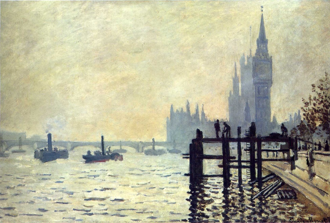

At left is Monet's The Thames at Westminster, (1871) once again demonstrating mastery of the attributes of art. Here, the spatial element dominates because we have such a strong sense not only of foreground and background but the middle field of the composition.Such depth is pleasing to the eye and it is interesting to note the combination of the low horizon line to denote the large building in the far background which we assume would otherwise not fit in the frame. A photographer coming upon this scene would frame it the same way. The aesthetic element is always there also with anything by Monet, as is some level of an emotional element. The Impressionist style simply includes a look that some would consider dynamic rather than merely decorative, and a mood considered active rather than passive. Here, I think Monet might have been trying to portray the size of the building in the distance by providing a strong depth of field.
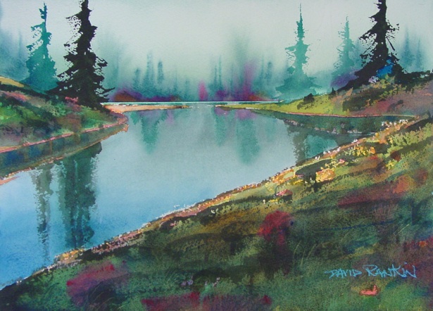
At center is a 2011 watercolor by David Rankin. The feeling of space and depth is strong here, in particular thanks to the detail to front and center distances in contrast with the fuzziness at the horizon. Note the vibrant color and strong reflection and how these elements give the work a touch of aesthetic beauty and some emotion as well. I think this artist might have created a work with such beautiful water and color to say that - perhaps - watercolor is a beautiful medium which Rankin has mastered. This level of image as message is known as visual literacy.
To the right we have a 2001 landscape by Frans Koppelaar. What is interesting about this is that it is described as an aerial perspective. Looking at the height of the vantage point, this would have been a difficult painting to achieve prior to the age of flight. Note the distant horizon line, high up on the canvas. Though seemingly simple, this work captures very well the idea of the spatial attribute of art. In terms of aesthetic attributes, it is more decorative than dynamic. As for emotional attributes it is more passive than active. In my opinion the artist achieved the goal he was after if this is a painting intended to brighten and deepen a room while providing little distraction, much in the way a window view from a mountain home would provide such a vista.
Image selection and commentary by David V. Pierik
Click links to visit sites for each work.
Click links to visit sites for each work.
Art Exhibit Critique:
DECO JAPAN: SHAPING ART AND CULTURE, 1920–1945
Asian Art Museum, Tateuchi Galleries, Seattle
"Jazz. Gin. Short hair and short skirts. The modern girl. The rise of film, and the advent of skyscrapers and air travel. After World War I, the world was changing rapidly. With the machine age came an increased emphasis on speed.
The art world answered with Art Deco, which had a driving energy that found expression in its use of themes from cultures all over the world, wild appropriation of other art forms, and graphic designs with fast lines that could be adapted and used on everything from housewares to posters, and for everything from politics to advertising.
By World War II, Art Deco had left its mark on almost every medium of visual art.
Deco Japan: Shaping Art and Culture, 1920–1945, with nearly 200 works, reveals the widespread and particular impact of Art Deco on Japanese culture. Through a wide range of mediums—sculpture, painting, prints, ceramics, lacquerware, jewelry, textiles, furniture, and graphic ephemera—this exhibition introduces the spectacular craftsmanship and sophisticated designs of Japan’s contribution to the movement.
Shown in our gem-like 1933 Art Deco building, Deco Japan offers you the rare opportunity to experience the full range of Deco artistry in a period setting."
--Asian Art Museum, 2014
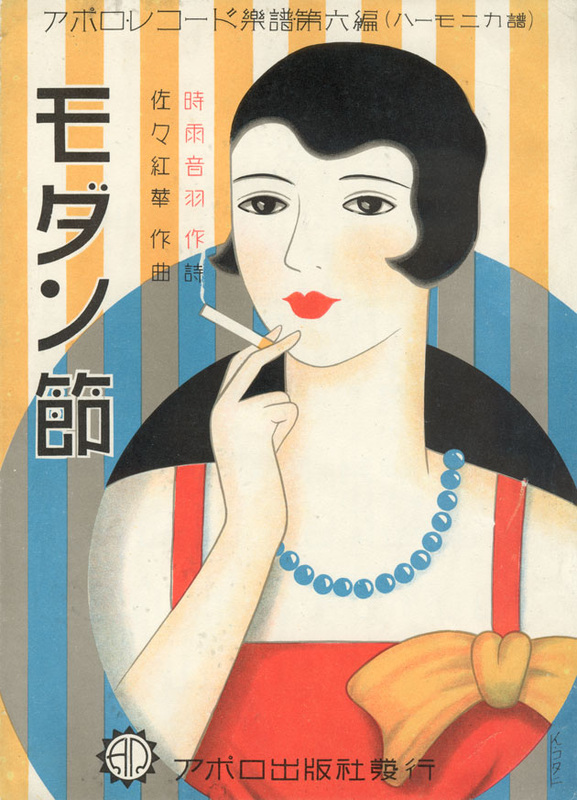
A Specific Piece that Stands Out to Me:
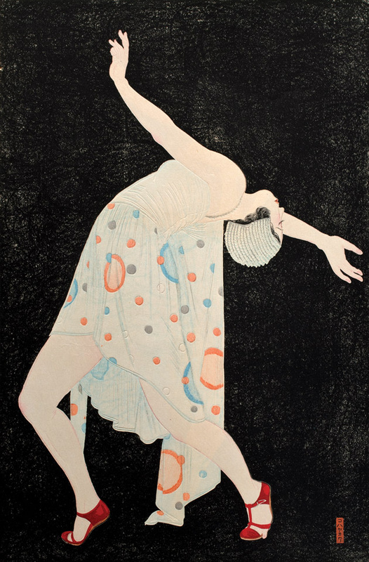
Dancer, or "Curved Line of the Instant" (left, above by Kobayakawa Kiyoshi, 1932, Ink and Color on Paper) really grabs me because it has such a powerful graphic design appeal. I had a great realization that Japan at this time was heavily influenced by what was going on in Europe, especially France and Italy in terms of art and fashion. The world was modernizing and industrializing and Japanese society was right there with it and in no way wanted to be left behind. The piece at left is a good characterization of the whole show. Photography was not allowed; this image is from the Seattle Art Museum/Asian Art Museum gallery.
About The Gallery:
The Asian Art Museum is located at Volunteer Park in Seattle and is part of the Seattle Art Museum. If you go on the first Thursday, Friday or Saturday, or the Second Thursday of the month it is Free. It turned out that when our family was up there it was a Free day, lucky us! What I find fascinating about Asian art is that I can look at it and see the influence that it has had on art from other cultures, as well as the influences other cultures have had on it.
Position the Artist Within the Context of Other Artists Within Their Day:
Kiyoshi was a Japanese commercial graphic artist and worked in the 1930s designing posters for social events, hotels, plays and any other jobs he could find. Similar designer-artists of the era were doing much the same thing in New York, Paris, Milan and other big cities throughout the world at the time.
Contrast This Artist with Another Artist that May Have Been More Successful At A Similar Project:
 By Franz Griessler, 1930, Tanzmatinee Trude Emmerling, Theater in der Josefstadt, Wien
Franz Anton Griessler was a 1930s-era Austrian painter who also lived in Hawaii in the 1930s, and published many song book covers, album covers and other art during his career. Although there were more famous artists and graphic designers during this era, what strikes me about this painting is the similarity here to the dancer above in terms of the pose with the head back. Perhaps this was something popular at the time on more than one continent. I also find myself wondering with Griessler's geography being in both Austria and Hawaii, if he influenced other artists. It is even possible that he and Kiyoshi could have met in Hawaii.
Critique ©2014 by David V. Pierik

