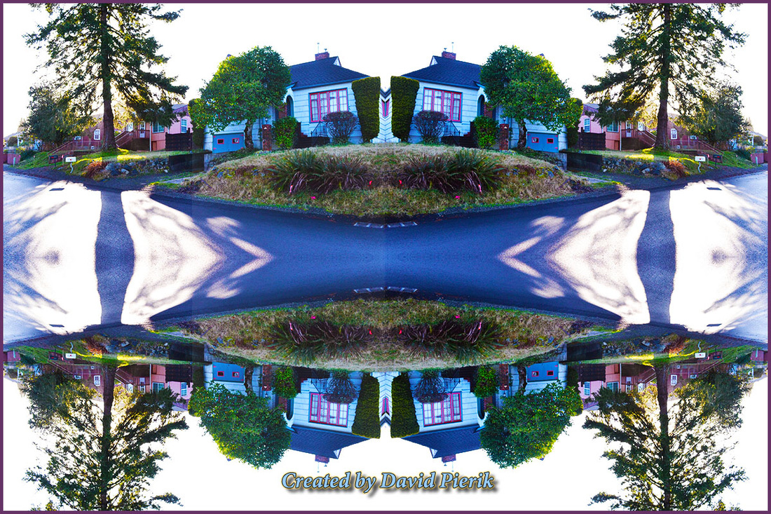
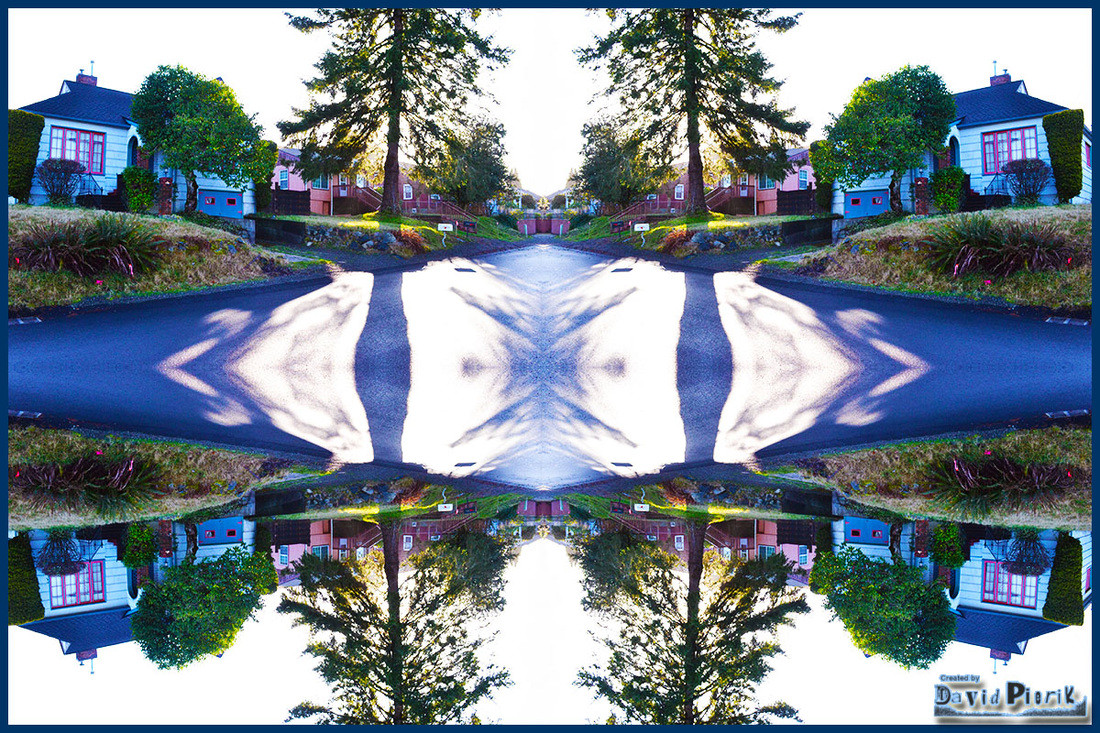
Reflection Images
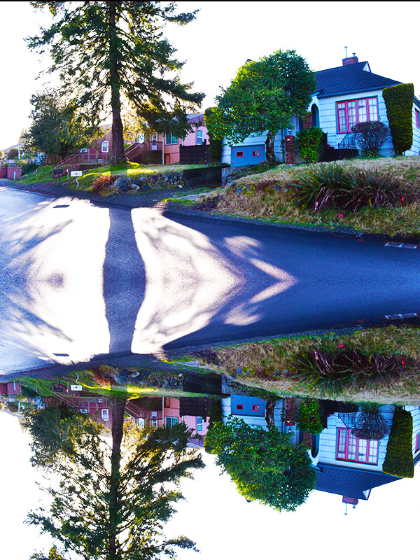
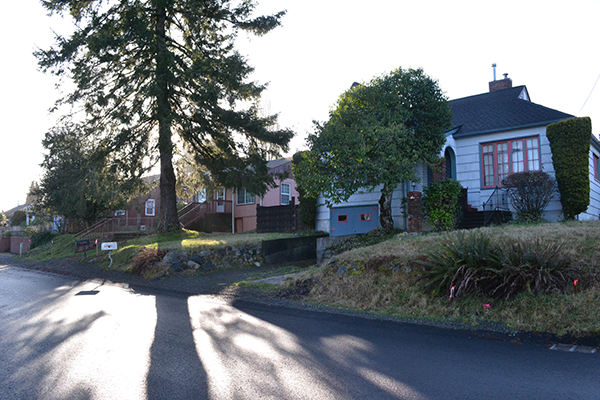
Though I have done some reflection-related things, this is the furthest I have taken this I think. The original image at bottom right was one I took yesterday, near sunrise in Shelton, WA. For this assignment I had a lot of choices of photos but when I saw the shadow from that tree I thought it might look cool in a reflection. It came out well I think.
I was very pleased with the kaleidoscope-like effect. And yes, I am going nuts with color adjustments. It's just too fun, and it looks too cool not to do it.
I was very pleased with the kaleidoscope-like effect. And yes, I am going nuts with color adjustments. It's just too fun, and it looks too cool not to do it.
Create a Panorama Image
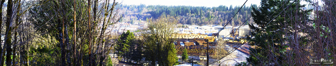
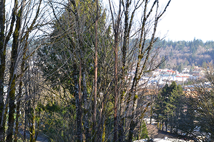
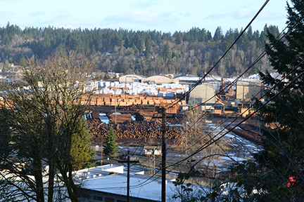
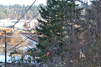
The Simpson Lumber mill dominates the view from Hillcrest on the South end of Shelton. I created the panoramic composition above in Photoshop using my three images below, which I shot RAW just after sunrise yesterday (Saturday, February 23, 2013) with my Nikon D3100. I absolutely love that camera, it does everything I ask of it and more.
I have created a few panoramic images already using Photoshop and it really is not that difficult. I do remember working with dark room technicians and graphic designers years ago to construct panoramic images for (b/w) newspaper reproduction and yes, that was more of a chore just a few years ago. I love b/w but I feel like I am rediscovering what is possible with color and I especially like the various color adjustments Photoshop makes possible.
For a good panoramic image, the right subject matter makes a difference, and you want to use a tripod if at all possible. To see some of my other images, visit http://davepieriksruleofthirdsgallery.weebly.com/archive-media-175-week-9.html (Archive: David Pierik Media 175, Week 9, on this same site).

Apply an Action to a Photo
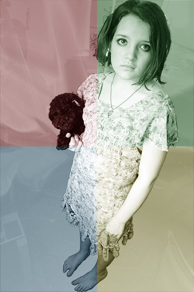
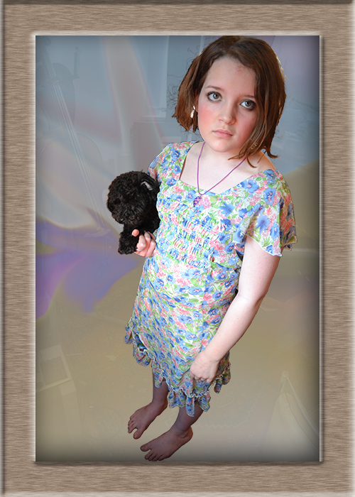

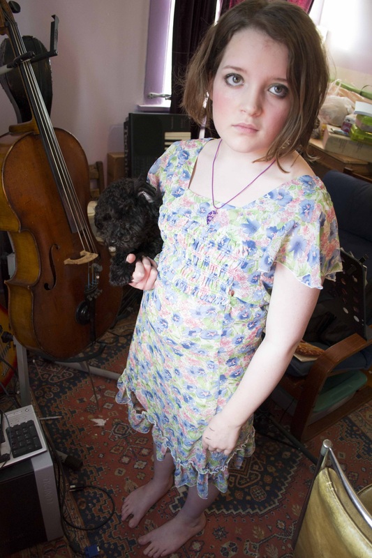
In Photoshop, applying a single action makes several things happen with just one command. From watching the tutorial videos, I saw how easy these are to do, and easy to customize also. For this week I started from the photo at right (which I had already modified starting from the one I took at left below) and used the action called quadrant colors, which is what turned her face green and her dog red. Kind of fun, and all at once it was just poof, done! I kind of like the wood frame action too (middle). Click for a closer look.
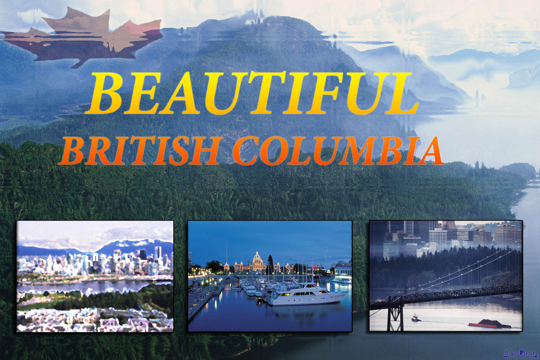
Advanced Compositing: Four-Image Postcard

The main thing I was working with on this was presentation, formatting and artistic filters. The gradient title, artistic filters on one or more of the photos, borders, drop shadows, highlights, double-burn images, etc. were a lot of fun for me. The version above features a crosshatch artistic rendering of the tugboat image at bottom right. The hard part was stopping.
If you would like to see a couple of other versions of the above, they are posted below. The left one includes a different effect, ink outlines, in the center bottom photo. My favorite filter was the glass block effect (above), which I did just for fun (click on the copy at bottom center to enlarge) and the bright version of the bottom left photo is paint daubs with some special selections (brush size 1, sharpness 1, brush type light rough). At bottom right is a version that appears to have no artistic filters but actually has a fine crosshatch in the bottom right photo; almost too subtle but it gives you an idea of the many possible degrees you can go with these filters depending on what adjustments you decide on once you're using them.
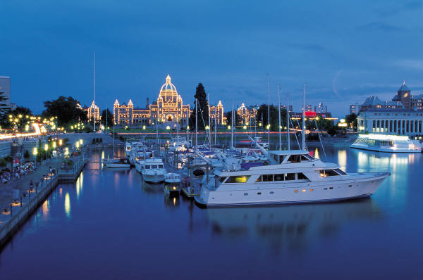
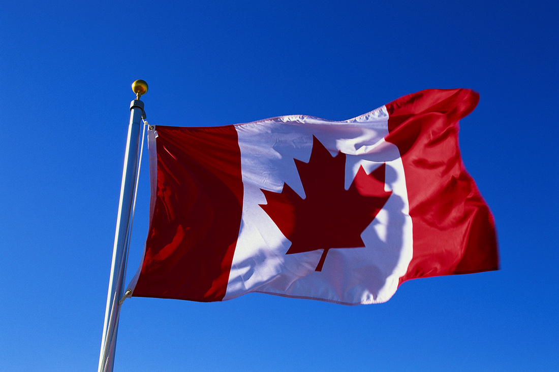
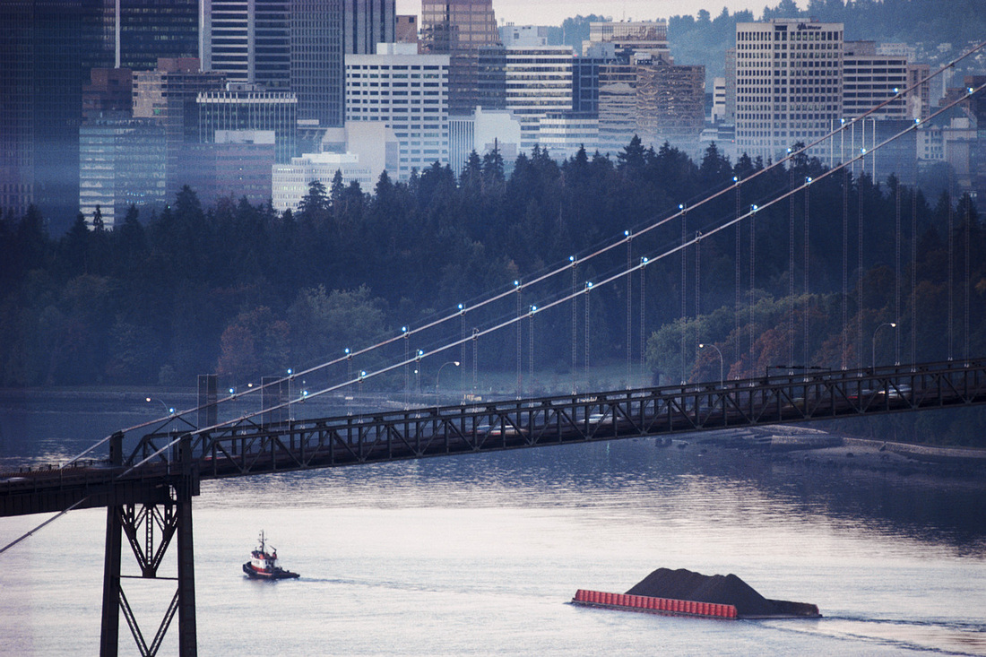
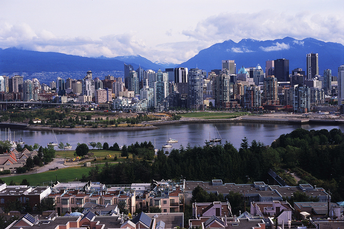
As much as I would have loved to have taken originals of the above photographs (as I have mostly done for other assignments), these are from Microsoft Images free stock photographs. I have seen beautiful things in Canada though, and I've enjoyed every visit there. I just was not a photographer at that time, or I would have taken some of the Buchart Gardens light show in Victoria. Another time I am sure. The background image is Vancouver Island (Nootka); at left on the bottom is Vancouver (downtown); in the center are yachts at Victoria BC, and at right are tugboats in Vancouver BC. The maple leaf image superimposed at top left was modified from the Canadian flag photograph. That was not required for this, but I felt it added an important element.
If you would like to see a couple of other versions of the above, they are posted below. The left one includes a different effect, ink outlines, in the center bottom photo. My favorite filter was the glass block effect (above), which I did just for fun (click on the copy at bottom center to enlarge) and the bright version of the bottom left photo is paint daubs with some special selections (brush size 1, sharpness 1, brush type light rough). At bottom right is a version that appears to have no artistic filters but actually has a fine crosshatch in the bottom right photo; almost too subtle but it gives you an idea of the many possible degrees you can go with these filters depending on what adjustments you decide on once you're using them.
As much as I would have loved to have taken originals of the above photographs (as I have mostly done for other assignments), these are from Microsoft Images free stock photographs. I have seen beautiful things in Canada though, and I've enjoyed every visit there. I just was not a photographer at that time, or I would have taken some of the Buchart Gardens light show in Victoria. Another time I am sure. The background image is Vancouver Island (Nootka); at left on the bottom is Vancouver (downtown); in the center are yachts at Victoria BC, and at right are tugboats in Vancouver BC. The maple leaf image superimposed at top left was modified from the Canadian flag photograph. That was not required for this, but I felt it added an important element.